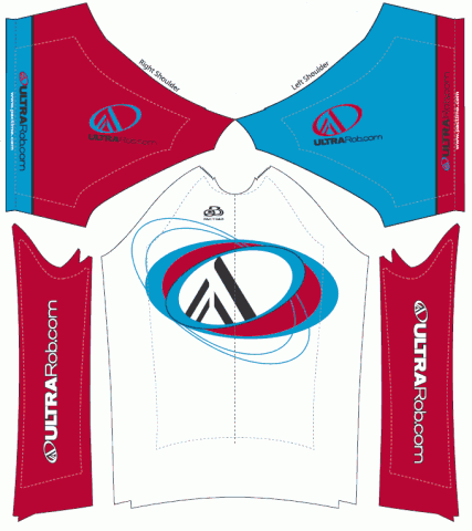
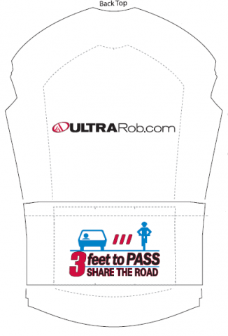
I’ve been planning to get UltraRob.com Bike Jersey made for a while and now they’re getting closer to reality. Below is an initial draft for the jerseys. It still needs some work but I wanted to show it to get your thoughts on it.
I’m getting them made in two versions. One version will have a 3/4 zipper and be unisex club fit (looser). I’m also getting a few made with full zip and in more of a race fit.
They’re telling me that if I get my order finalized by early next week, I’ll have the jerseys by the 2nd week of August.
Win One
To encourage feedback on they jerseys, leave a comment below by 8 AM this Friday morning, July 2nd and you’ll be entered to win one of the club fit jerseys.
Buy One
I’m also going to have the jersey available to buy. The 3/4 zipper club fit jerseys will be $50 and the full zip race fit will be $80. If you pre-order by this Monday July 5th, I’ll throw in free shipping. Unless I get several pre-orders for the race fit jerseys, I’m not getting any extras made so if you want one of them, you’ll need to pre-order. I’ll order a few extras of the club fit but pre-order if you want to make sure to get your size plus you’ll get free shipping.
I’ll get a PayPal button added in the next day or two along with instructions on pre-ordering.
Although the club fit jerseys cost quite a bit less, they still have a nice feel to them. I’ve heard people say that the Pactimo jerseys fit small. From the fit kits I have, I don’t think that much different than most of the jerseys I’ve collected in over 20 years of racing. The race fit ones though fit tighter than the club fit ones. If you’re local and want to try on one of the sample kits, let me know and we can figure out and time for you to try them.


 Blog RSS Feed
 Like on Facebook
 Follow on Twitter
 Flickr
 Contact

Nice jersey. I like the logo you’ve designed and it’s use with the typefaces on ultrarob.com. The 3′ to pass graphic is a nice touch. Well done.
Rob,
Nice design…I especially like the alternating colors on the shoulders and the incorporation of the 3 feet to pass message. Great job…would of course love to “win” one.
Drop me a line on facebook if you are ever looking for some company on any Chaffee/Lake County riding…especially Pb shakedowns.
Good job,
Andrew Miller, Buena Vista
I’m so out of shape I’m delaying coming up to train for Leadville until probably late July. I would love to have somebody to ride with when I do and will try letting you know.
Great bit of promotion for your site, works well on the jersey.
Massive fan of the Share the Road message, that is excellent. The Amy Gillett Foundation jerseys we wear carry the same message. http://www.amygillett.org.au/merchandise
Keep up the great work superstars!
Rob,
Not sure I like the mostly white front and back–I’ve had mostly white jerseys in the past and they always ended up looking crappy after the first ride in the rain. Tell you what though, if I can get one of those with the stars & stripes on the collar and arms you can sign me up 🙂
cheers, matt
I’ve been concerned about so much white and was thinking of maybe having the bottom blue fading up to white to help keep it from looking dirty.
I agree on the white. The blue fading up into it would be a good iea.
I like the design. Only thing that I could think of would be to make the logo bigger on the back. So when you are passing people, they now who it is.
Are these sleeveless, half or long? If you go with a blue to white fade, I’d keep the safety logo in a white background and it looks like you can stretch it a bit bigger.
It’s not clear because of the way the sleeves are in the template but they are typical short sleeves. They come down about 3/4 of the way to my elbow.
Rob:
I like it! The idea of fading from blue to white on the back is a good one too. Just like Greg suggested…make your logo on the back bigger….after all it is a marketing tool too. I like the white to help make things cool on those hot sunny days here in CO. Would love to win one too and I would wear it proudly.
Enter me! Cool jersey, Rob.
I agree with the blue fading into white and bigger logo on the back. Is the collar all white? I think having some color there would be a nice touch too. Overall, very nice design.
I really like the Share the road logo on the back. I hadn’t seen it before today. It’s a great idea. It will also give drivers something to read as I ride past them in the traffic jams 😀
Colours are nice to. Although I might be slightly biased as the red is very close to the colour I’ve used on my own business card heheh
I really like the “3Feet to Pass” bit on the back. Nice colors too!
I’m with everyone, not a fan of the white on the back, first puddle and the jersey is probably ruined.
Love the colors, also love the sleeveless style.
I really like the message of the 3 feet to pass motto–though riding in DC like I do makes me think that’d actually make me a target for the bike haters!
Love it! I think the “3′ to pass” art should be on the back of every jersey.
Nice clean and crisp design. Share the road on the back is a great add-on. It seems I’m in the minority as I like the amount of white on the back. It helps the logo stand out.
Sweet. Clean. ‘cept women not as keen to have a white front in vase it gets wet….
I guess I’ll go against the grain and say I dig the white, but then again I prefer to be scene on the road 😉
[…] to everyone who gave their feedback on the 1st draft of the jersey design. Congratulations to Joe Grossi as the lucky winner of a free […]