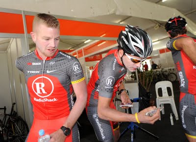
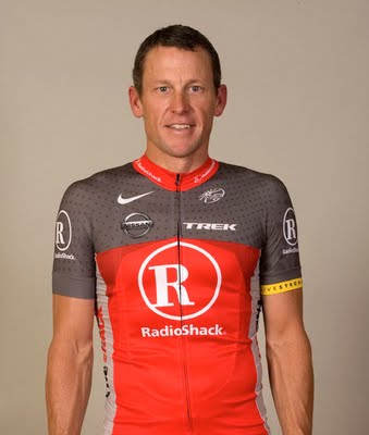
I had posted on twitter when the first RadioShack jersey was modeled by Lance Armstrong that it looked old and outdated just like RadioShack. Since then the Team RadioShack jerseys have been refined.
Although they’ve kept the same general look to the jerseys, I think they have look much better than the original one. They don’t have such a cold, industrial look from the past.
2010 seems to be the year of the ugly cycling jerseys. Although I’ll now give the Team RadioShack jerseys a passing grade, there’s no way I’ll give the Footon-Servetto-Fuji team jerseys a passing grade.
– UltraRob
|
|
|
Tags: cycling, Lance Armstrong


 Blog RSS Feed
 Like on Facebook
 Follow on Twitter
 Flickr
 Contact

The Footon kit just blows my mind. Not only is it an "interesting" color choice, it's just poor marketing for the sponsors if you ask me. Though I suppose that they are getting any attention is good for the sponsors. Still…
That's a crappy kit (colors I mean) and the season hasn't even started yet and somebody's walked all over those poor guys. 😉